 While my wife and I have had the occasional difficulty with it over the years, I like our credit union, Vancity, quite a bit. But I really have to question the competence of the people they work with to create some of their online services, especially those associated with our Vancity Visa credit card.
Take this problem I had more than six years ago. In short, trying to use my Visa to pay online, I ran into the wonderfully annoying Verified By Visa program. It wouldn't let me register because (it turns out) the online form wanted the birthdate of the primary account holder, who is my wife. But the error message said it wanted my Social Security Number, which (a) we don't have in Canada (it's a Social Insurance Number here), (b) the form hadn't asked for, and (c) is not something I'm comfortable giving out willy-nilly online. That led to a wild goose chase until I figured out the solution by trial and error—while Vancity and Visa's customer service reps were no help whatsoever.
Six years of not solving a problem
Vancity and Visa have spent the last six years not solving that issue. In fact, on another website, they've exacerbated it. This time the resolution was better, but the problem was even worse, because if I hadn't been on the ball it could have cost me almost $500, maybe more. Let's follow the steps:
- I wanted to redeem some My Visa Rewards points to book a hotel for a three-night stay. The site where you check your account balance, including points balances, is MyVisaAccount.com. However, you can't redeem points there. And there's no link to the site where you can, or indication of what it might be, as far as I could tell.
- The Vancity website (different from the MyVisaAccount site) has a link to redeem points at the MyVisaRewardsPlus.com website. But guess what? That link is broken, because you have to use the www.MyVisaRewardsPlus.com—if you omit the www, as Vancity itself did on its own corporate website, the link won't resolve, even though pretty much every website in the world (including mine here) lets you use the www or not, as you choose. Professional!
- Once you get to the rewards site, you have to set up an account or log in using your Visa card number. But, just as in 2004, I had to use the card number of the primary account holder (my wife). I couldn't use my card number, even though my card charges the same account, and accumulates points there too. So I had to call her and get the info, including expiry date and three-digit safety code, since she was at work. Oh, and the login form (like most) refuses to process card numbers entered with spaces—even though that's how they appear on the card for readability. As a sometimes–web developer, I know it's rather simple to have a computer skim a series of numbers and strip out excess spaces or dashes. People should be able to enter their credit card numbers however they want, but almost no e-commerce site does that, Vancity's included. They all piss me off because of that, and this was no exception.
- Once I found the hotel I wanted and had selected the dates and room and everything, I had to fill in another form with contact information. Some of it was helpfully filled in (with my wife's data, of course), but some, including our city, province, and postal code, and my wife's birthday, were not. Here's the fun part: the birthdate (like the account number) must not include spaces, but the postal code must include a space. Other variations fail, even though those requirements are opposites, and again, they're programmatically trivial to deal with however people choose to type them.
- The site asked me how many points I wanted to redeem, but while the My Vancity Account site and other pages on the rewards site displayed my points balance, the form itself did not, so I had to check in another window.
- Nowhere on the booking form does it indicate how much points are worth. So were my nearly-60,000 points enough to pay for the nearly-$500 hotel bill? I had to guess. I tried 50,000, but that was too much. The form did tell me that I couldn't over-redeem (i.e. couldn't use too many points) by more than 100 points, and I had to use 100 point increments. It did not have a way to fill in the point amount automatically, based on my total planned purchase. And rather than tell me my mistake when I guessed and then clicked the (unsurprisingly useless) Calculate button, I had to submit the form and then have it rejected because I was trying to use too many points.
- Fortunately, it let me try again without starting over. (If I had used too few points, would it have gone on happily and simply charged the balance to my card for me to pay in real money, even though I had more points to spare? I don't know, but at this point I suspect it would. Small mercies I didn't have to find out.) And I still didn't know what 100 (or 50,000) points were worth. I guessed wildly once more, and thought 100 points might be a dollar, so I entered 48,400 for my $483.50 bill. Bingo! $484.00—I had spent a mere 50 cents too much.
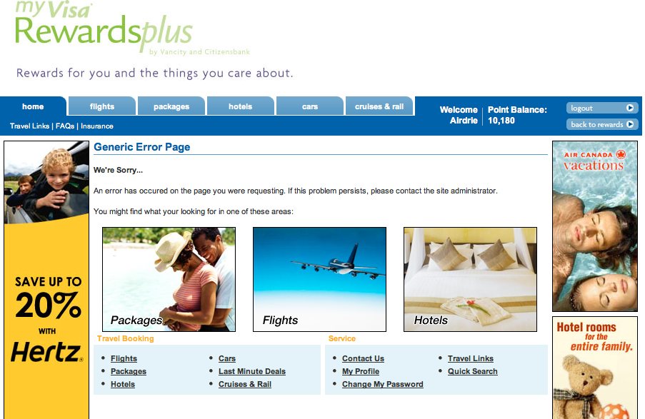
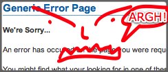
- Home stretch now. My transaction was processing. (Incidentally, there was no final confirmation screen where I could confirm I had the right hotel, or that my dates were correct, or that I really had booked a suite as I intended to. It just started churning on the booking.) Then what did I get? I am not kidding about this, I got a Generic Error Page. That was the title, and the headline, in big blue letters. In case you don't believe me, here it is:

- So, had my purchase gone through or not? No idea. I had to assume it had failed, since that's usually what "error" means. So I went back all the way to the home page and found the same hotel, same dates, same room selection, same price, same points, and tried again. You guessed it, "Generic Error Page."
- Then I noticed something. My points balance had dropped by 48,400, so in some way the transaction had gone through. There was no confirmation page to say so, no hotel booking page to print out, no email to say the hotel was happy to come have us visit. But something had transacted, somewhere.
- One helpful thing is that there's a toll-free phone number at the top of each page on the rewards website. I called and got right through to Marcie, who was everything the website wasn't: helpful, friendly, quick, knowledgeable, and able to get me what I wanted in short order. (I should have used the phone to start with. But that's no excuse for the moronic website.) Anyway, after Marcie confirmed I was who I claimed to be, she discovered that yes, both bookings had gone through, though no, confirmation emails hadn't been sent out to anyone.
- Of course, to the My Visa Rewards computer system, it seemed perfectly logical for someone to book two identical rooms, with the same number of guests whose children are miraculously the same exact ages, for the precise same dates, purchased four minutes apart. So the first booking had used my points, and the second one (for another nearly-$500) had been charged to my (wife's) Visa, and had I not called we might have had to pay for that. Marcie arranged to cancel the double, and even called the hotel to make sure they had the bookings and knew that one would be revoked because it was a mistake.
- In the end I got the booking I wanted, for the dates I wanted, at the hotel I wanted, in the city I wanted. I think. Yay. But the confirmation email still hasn't come (well, I don't think so—of course it has to go to my wife's email address, as the primary account holder, so she'll need to check again in the morning when she wakes up). I don't yet have a confirmation number for the hotel, or know for sure that the points will be used to pay for the proper room, and that the mistaken second room will be refunded. Marcie gave me confidence, so I expect so, and I'll be watching like a hawk until all the various flying bits and points and dollars resolve themselves. I'll phone the hotel myself to triple-check our booking.
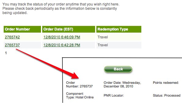
- Finally, the My Visa Rewards site does now show the purchases in my redemption history, but only in the most generic possible way. Here, look:

It tells me that I've booked a Redemption Type of "Travel" at a Component Type of "Hotel Online." No hotel name or city, no booking dates, and the Points Redeemed field is blank for both transactions. I don't even know which one will be voided and which will use my points. But they've been processed! Thanks!
UPDATE Dec 9, 2010: Yay, we received the official confirmation email. Just one, which is a good sign. I've contacted the hotel to verify everything. I expect our booking is all good, but I'll let you know either way.
What would normal people do?
Imagine, if you will, that I were not a guy who's been building websites of my own for 13 years. Someone who hasn't worked at commercial software companies and is not familiar (as I am) with how the architecture of both the Web and credit card processing works. Someone who hasn't also worked in the entertainment and hospitality industries, and who does not (again, as I do) have some idea about how hotels interact with external travel agents and online booking services. Someone who isn't on medical leave with terminal cancer (sorry, had to get that in), and who doesn't (as I do) have the spare time—since I happened to feel well today—to power through this process, making educated guesses along the way, and then write it all up in a ranty blog post.
Imagine if I were a normal person, in other words, not a freaky nerd who has an interest in the usability of web applications. A normal person might have given up at any of the many initial roadblocks and never booked the hotel (or, sensibly, might have tried the phone first). Or he might have gone through the process and then given up at the Generic Error Pages, not realizing that his points had been used up and his card had been charged another $500 for a duplicate room he didn't want. Or she might have never taken the trip, only to discover next month on her credit card bill nearly $1000 of mysterious hotel bookings for dates now several weeks past. Or, worst of all, he might have booked and paid for another hotel, not using points, and then later discovered that (a) he'd wasted his money, and (b) the original hotel was cheesed off because two sets of guests had been no-shows!
On their own, each of these design problems, errors, and pointless requirements is a small thing. Together, though, all in a row, they are a spinning fan just waiting for the shit to hit it. The websites are not pure chaos, like Microsoft Research's mercifully long-dead Wallop social networking site of five years ago (a sort of proto-Facebook snuffed out in infancy, for good reason). But that makes them even worse, because the Vancity Visa sites look like they know what they're doing, only to reveal themselves slowly as death by a thousand cuts.
My questions for Visa and Vancity
Did the teams who built this system include any qualified interaction designers? Did they do any usability testing with real people using real credit cards trying to do real things, typing in numbers the way real people might wish to do? Did they consider any edge cases at all, such as a married couple who have separate cards on one Visa account (something Vancity encourages), where the non-primary account holder might want to redeem points as easily as he or she can buy things to accrue points?
I can only conclude that no, they did not. Vancity is one of the largest credit unions in Canada, larger than many banks. Visa Inc. is a member of the Fortune 500. That they could, together, construct such a house-of-cards online system for something as apparently simple as redeeming bonus points is shameful. Incompetent, really.
So many other companies manage to get online commerce much more right, so it can be done. In the end, I'm glad I got what I wanted. (At least, I think I have.) I'm not angry. Marcie on the phone was a great help. But I'm sad that the process revealed how little Vancity and Visa seem to think of their shared service on the Web, and the customers who want to use it.


 While my wife and I have had the occasional difficulty with it over the years, I like our credit union,