« Penmachine.com home « Long article index | « Back to "Part 1: Ideas" « Back to "Part 2: Design"
Building a Standards-Compliant Website...
...with an internal team at a small company
by Derek K. Miller
This piece was originally published in my online journal on 9 May 2004.
Part 3: Content
Up to now, I've talked about:
- Why I got into web standards while working at Navarik.
- The ideas we developed for a new company website.
- How we put together a design and back-end technology for the site, and why it was important to comply with web standards in doing it.
But I'm a content guy, and getting the content right was the last stage we had to go through before putting our site live last week.
Content and design
People have differing opinions about the role of visual design (or art direction) on websites.
It's kind of a silly argument. Of course visual design is important on the Web. (We're primates—visual animals. If dogs had invented the Web, it would probably have a smell component, and I don't think they'd be arguing about whether smell was important in their designs. It would have to be.) Compare this to this (or any other variant of the same page). See?
It was when browsers became graphical in the early '90s that the Internet became a public phenomenon, and it was to introduce visual design that people started hacking with HTML in all sorts of nasty ways—which web standards advocates are now trying to rein in with CSS-based design. But the goal remains: visual design is informational, as well as pleasurable, and good design makes for a better website.
On the other hand, the Web is still primarily about the text in it—XHTML is Extensible Hypertext Markup Language, after all. Text is what Google cares about, and for the most part, it's what people care about too. A nice-looking site with no content may be pretty, but it's not very useful.
So our next and last goal (which was also the first one) for the Navarik website was to write words that properly represented what the company does.
Who are the visitors?
I wrote before that websites are for the people who visit them, so we had to ask who our visitors were, and are likely to be in the future.
For the most part, according to Bill and Nathan at Navarik, they are shipping people who have heard something about the company, either because they already use our software, through word of mouth, or from a web search. There are also others, either members of the general public who stumble across the site, technology people reading about some of the things we do, or media staff. That meant, after a bit of analysis, that we had four audiences:
- People in the shipping industry who already use Navarik's products, and want to know more about who made them. (Many of these users might work with Navarik's software every day, but not know it until they notice a small "Service by Navarik" link at the bottom of a page. Since our software runs in a web browser, it takes a simple click on a link and they're seamlessly on our website.)
- People in the shipping industry who don't yet use Navarik's products, and who want to know what the company does.
- People who work in a technical field such as database programming or web design, and want to know how Navarik uses open-source tools, Internet standards, and other technologies it its work.
- People who don't know shipping or technology especially well, but want to understand what this Navarik organization is.
We'd been thinking about these audiences all along. For instance, last summer, we spent a surpringly long time brainstorming ideas to come up with informational divisions in the site structure, as well as the tagline—"web-based systems for the maritime bulk shipping industry"—that you see in the banners at the top of each page. In late 2003 and early 2004, many of the company's staff took part in even larger brainstorming sessions about the larger purpose and goals of the organization, which helped us focus even better on the goals for the website.
What are we telling them?
Dave used our audience profiles and goals in his design mockups, which took advantage of Navarik's existing (and very aquatic) logo, a blue-based colour scheme, and strong images of masts and flags to establish what kind of company it is.
Therefore, even if you zoom way out so that the content is unreadable, you still get a sense that Navarik is in the marine shipping industry:
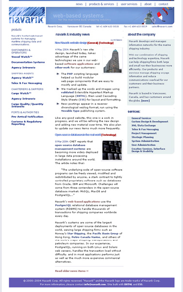
- Existing Navarik users and others in the industry get the impression that Navarik is "one of them."
- Those outside the industry get a good sense of where we fit in the larger scale of things.
- Our clean design and navigation show that we're professional and know what we're doing—to shipping professionals, technical experts, and the general public alike.
Navarik's products and services are fairly complex—no one is likely to visit the site and pony up a credit card to buy a web-based cargo information management system for hundreds of users around the world. So the site is, in effect, a piece of "brochureware." Avoiding the static dullness that implies is why we set up the weblog-based news postings I wrote about in part 2, which over time will make the site grow and help reveal more about what we do and how we do it.
The home stretch
Here we were: April 2004 and still no website. What we had accomplished and what still needed to be done would only have taken a couple of weeks of dedicated effort from our team, but Navarik is not a large company. Each of us—especially Bill and Nathan, as key salespeople for the company—had many other things to do that were more vital to keep Navarik running.
Eventually, though, we knuckled down and go to work. The process went something like this:
- Bill sat down at his iBook and roughed out his ideas for each page in our site structure, emphasizing key points about products, services, and the company.
- Nathan reworked some of that material with his extensive knowledge of shipping, our products, and our customers.
- I edited the results for style, structure, grammar, flow, and web markup.
- Dave continued to hammer away at his designs with feedback from the rest of the team and other Navarik staff, and created graphics and forms for user support and contacting the company.
- We batted the results around between the team members a few times, adding and subtracting content, updating links, and generally polishing the site as we posted comments one of our internal weblogs, which we use for creative and design discussions.
- When we were happy enough with the site, we waited a couple of days to let the rest of Navarik's staff look it over, do some basic usability testing, and make comments. We incorporated some of those comments into last-minute changes.
- Finally, on Tuesday, May 4, 2004, some 10 months after Bill and I first started talking about reworking the site, we put it up.
But that's far from the end. A good website is always under construction. Even in the few days since the launch, we've fixed some minor errors, made some small improvements, and started making plans for some of the bigger items we had to leave out in the first round. We've learned lessons we can apply in web design work for other customers. We keep building, to make the site better over time.
« Penmachine.com home « Long article index | « Back to "Part 1: Ideas" « Back to "Part 2: Design"
Page BBEdited on 12-May-04 (originally published 9-May-04)
© 2004 Derek K. Miller. Some rights reserved. You may use content from this site non-commercially if you give me credit, under the terms of my Creative Commons license.
![]()