Penmachine
09 October 2009
Myriad type choices
This week I walked around our neighbourhood a bit and took some photos of signs. I'm not much of a typeface nerd, but I did notice something.
Some years ago, when I designed the first version of penmachine.com, I created the logo header using the font Myriad, which I've liked for a long time:

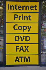
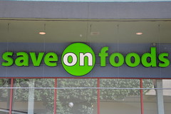
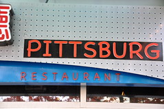
Various weights and styles of Myriad have become my go-to Penmachine fonts, for the cover of my 2005 album, as titles for videos, and so on. When I picked Myriad, I didn't find it too common. But over the past two or three years, it's started showing up more often elsewhere. Here were a couple of examples from my walk:
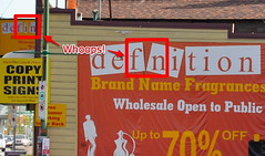
Myriad is versatile and friendly, so I'm not surprised that I'm seeing it more. Of course, there are also lots of... uh... less elegant choices out there:
If you ever wonder what a particular font is, WhatTheFont.com lets you point to or upload a picture and will try to figure it out automatically for you. It doesn't always work, but especially if you have a clean image, it often does a good job.
Labels: font, geekery, vancouver


