Penmachine
29 September 2008
New site design for Navarik
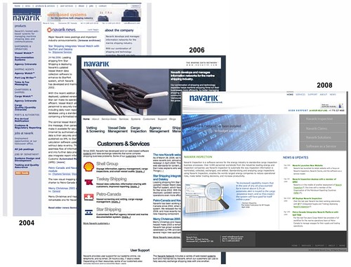
I've worked for Navarik, a company started by some of my university colleagues, since 2003. But I was involved with the the organization almost from the beginning in 2000, doing freelance writing and editing work and helping out with the website. That site has been through numerous incarnations over the past eight years, including a new version that just launched this week. Here's a comparison of what the home page has looked like over the past three generations (2004, 2006, and now 2008):
The overall feel of the site hasn't changed too radically: the blue-and-white colour scheme has been there all along. The logo, designed by Ryan in 2001, is also much the same. But the company itself has shifted its focus, so that it now describes itself as "a software service provider to the petroleum supply and trading industry." It began back in 2000 as a developer of web applications for small marine shipping agencies and shipbrokers, but now our customers include some of the largest companies in the world, such as Shell and BP.
The fine new site is much more straightforward and reflects what the company does far better than the previous one. Yet it does make me a little melancholy. I've been off work for more than a year and a half because of my cancer treatment, which means that I had nothing at all to do with this redesign, whereas I was in charge of the previous two. This relaunch is the first time I've been uninvolved for many years.
Labels: design, navarik, oil, web

