Penmachine
20 November 2007
iPod Touch: my first impressions and review
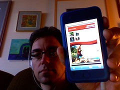
 Since I'm on medical leave from work and am sitting at home feeling slightly barfy, I've had a fair bit of time to try out the iPod Touch I received yesterday. My summary: like its sibling the iPhone, it is a fantastic little portable computer. For video, enhanced podcasts with artwork, listening in the car, web browsing, and reading text, it's fabulous. However, as a pure portable music player, I think the other iPods are superior. Here's why.
I miss the click wheel
The iPod Touch and iPhone lack the classic iPod click wheel, or even the round switch arrangement of the iPod Shuffle. The Touch and iPhone screens are big, beautiful, touch-sensitive blank slates—which makes them impossible to use if you can't see them. So when my iPod Touch is in my pocket, I can't skip songs, change the volume, scrub through a podcast, or even pause a track without taking it out to look at it. When I'm on the go, it's therefore slower and more awkward to use than my 5G iPod.
Yes, if you have an iPhone (not yet available in Canada), the headphones include a simple remote to address some of those problems; on the iPod Touch, you need to buy a third-party remote, which I'm seriously considering. Even then, you have only rudimentary, iPod Shuffle–like control over your player.
The click wheel is one of the great genius pieces of design in Apple's iPod lineup, a patented, distinctive component of the iPod's success since 2001. It's brave of the company to ditch it entirely on these new flagship models, in favour of the remarkable new "pinch, tap, and flick" multi-touch interface. But when you're used to the familiar thumb-spinning action of the click wheel, having to hunt for onscreen sliders and scrubbers and virtual buttons is, simply, a chore.
Good for music, great for much else, destined to get better
Don't think that I dislike the iPod Touch. When I use it, it feels like a piece of the future in my hand. I'm hugely looking forward to Apple's promised software development kit (SDK), coming in February, after which programmers everywhere will be able to create all sorts of amazing applications for it, from document readers and word processors to games and screen savers—on top of the already impressive selection of web apps out there. Right now we're limited to the programs Apple ships on it, which are interesting but few.
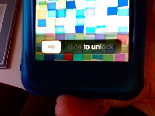
Because it is a more general-purpose device than other iPods, I find there's more tapping and menu navigating on the Touch, because it does more, but that makes it a little slower to use for most tasks. Some features I've become used to with other iPods, such as using my Belkin audio recorder or setting up the device as a USB flash drive, are unfortunately gone too. Like most iPods, it also feels rather fragile on its own, so I picked up a silicone case and screen protector today from Westworld, seemingly the only retailer in Vancouver with any iPod Touch accessories at all so far.
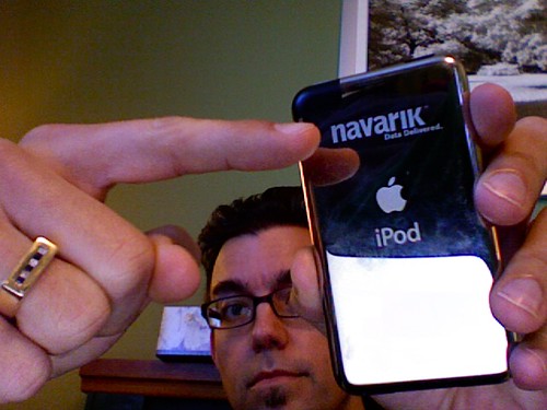
Compared to the iPhone, it has no camera, speaker/mic, physical volume switch (argh!), headphones with mini-remote, or certain built-in applications (local client email, Google Maps, etc.)—so you have to use them via the Web. The colour scheme is a bit different too. The front bezel is dark, and the back is the usual smudge-o-licious iPod chrome, rather than the flat metal of the iPhone.
It does have a YouTube app and, best of all, Apple's Safari browser. Most websites work perfectly, and the ability to zoom, rotate, and manipulate the display makes everything from using Gmail or WordPress or Blogger to reading blogs and news sites simple and surprisingly pleasant for such a small screen. The onscreen keyboard doesn't beat something real to type on, but particularly in landscape mode it works tolerably with my largish fingers. (Someone who builds an external keyboard for this thing will sell quite a few.)
I think it would make a great e-book reader, but right now there is no easy way I know of to load up text or PDF documents for reading. The Touch can display PDFs and text files from the Web very well (though I wish text files would word-wrap more neatly), but unless you want to set up your own web server (not hard for webby geeks like me) or email yourself a book (feasible but awkward), we'll have to wait for the SDK before that's easy.
Early in the revolution
The multi-touch interface is a revolution, though an early stage one. My fingers are finding themselves a bit confused. I still instinctively try the circular motion of the click wheel when wanting to adjust the volume, pause, or change tracks.
And when I get back to my MacBook laptop, I'm really flummoxed, because there I can scroll with two fingers on the trackpad too. But the scrolling direction is (quite logically, but still contradictorily) completely the opposite of the flicking motion on the Touch. On the MacBook, to scroll a page down I put two fingers on the pad and drag them down; on the Touch, I use one finger on the screen and flick the page up. The transition is like switching between two languages you're fluent in—it takes a bit of time for your brain to make the change.
The cool factor of the iPod Touch is certainly hard to beat. The screen is super-sharp, and photos and video look just great on it. The Touch also works perfectly with my car FM adapter, and in that context it's better than the old iPod because you can see the screen better—but I had to turn the brightness down when I tried it last night, because it was like a searchlight compared to the dashboard instruments!
A device unsure of itself
When the iPhone first came out, many people wanted one without the phone part. The iPod Touch is pretty close, but that also makes it a device that isn't quite sure what it wants to be. Is it a portable computer? A music player? A video device? A web appliance? Well, yes and not quite. Apple positions it and the iPhone as their top-of-the-line models, but if you listen to a lot of audio, or need to record, or like to store data too, think carefully. The massive storage and reliable old click wheel of the iPod Classic or the miniscule convenience of the iPod Nano might work better for you.
Despite that, I suspect that I'll be carrying and listening to the iPod Touch a lot more than my old 5G iPod. When I wake the screen from sleep and slide the virtual switch to unlock it, or flip the iPod sideways and watch the screen display flip too, or grab a chunk of web page and move my fingers to zoom it, or flick a list of podcasts and observe the carefully-calibrated ballistics of how the list decelerates to a stop, there's something amazing about that experience. It's a new kind of computer in my pocket.
A few niggles here and there don't negate the amazement. And I get the feeling that once it's no longer amazing, that experience will simply be something I expect, and almost everything else will seem old-fashioned.
Labels: apple, design, gadgets, geekery, ipod, macosx, music, video
Comments:
Unfortunately, waiting for the iPhone could have me waiting for awhile. For now, I'll just watch others have all the fun.


