Fonts and wine
Permalinks to this entry: individual page or in monthly context. For more material from my journal, visit my home page or the archive.
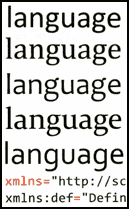
 Whatever your opinions about Microsoft, you have to acknowledge that the company's typography division has generally done a great job with its fonts for reading onscreen—and the ClearType technology for displaying them on LCD monitors. Microsoft's upcoming fonts for its "Longhorn" operating system are no exception.
The new typefaces are called Calibri, Cambria, Candara, Consolas, Constantia, and Corbel (so that they sort close together in font menus), and follow up on the now ubiquitous set that includes Georgia, Verdana, and Trebuchet, widely used on websites, including this one (as well as the dreaded Comic Sans).
As a font amateur, I find the way typographers describe fonts funny, the same way I find wine connoiseurs' desciptions of wines: "I would describe Corbel's personality as crisp and refreshing." "The italic isn't fussy and the numerals are strong and sophisticated." But it's good to see Consolas, a fixed-width font that isn't related to Courier.
Pity that Mac users might never see these fonts, and that even the Windows-using world apparently won't get them until Longhorn ships, which is in about, oh, a gazillion years.


