Penmachine
28 September 2009
SOLD: 2005 12-inch iBook G4, $450 Cdn
UPDATE: As of the beginning of October, the iBook is sold, sorry! Thanks to those who were interested.
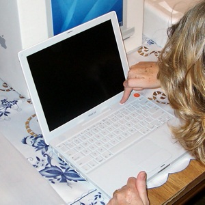 Back in 2005 my wife Air bought her first laptop, the excellent workhorse 12-inch iBook G4 (the photo shows her starting it up for the first time back then). She replaced it with a MacBook earlier this year, and we're not using the iBook as much as we thought, so it's time to sell it to someone who'll take good care of it.
We're asking $450 Canadian. Our friends and blog readers get first dibs, and if you're in Greater Vancouver, we'll deliver it or arrange to meet you. If you want a small-size 12" Mac notebook, this is one of the last ones Apple made (with a matte screen, even). Air has been the only owner, and she's treated the iBook very well.
The details: it has a 12" screen (1024x768 resolution), 1.2 GHz PowerPC G4 processor, 768 MB RAM, 30 GB hard drive, Combo Drive (CD, DVD, CD-R, CD-RW), AirPort Extreme (Wi-Fi 802.11g) wireless built in, and ATI Radeon 9200 graphics. Mac OS X 10.5 Leopard, iLife '09, iWork '09 are installed. You get the original iBook install and restore disks, box, packaging, cables, etc., and a new battery.
I just completely restored the software install, so the machine boots up with the Setup Assistant like it's fresh from the factory for you to configure as you like, including all the swoopy Apple multilingual "welcome" space graphics and groovy "do do dee-do do" startup soundtrack. The case, screen, and keyboard are all freshly cleaned. It's white like a kid's teeth before they're old enough to drink Coke, coffee, or red wine.
Email me or contact me via Twitter or Facebook if you'd like to make a good home for this little cutie.
P.S. I think we have a couple of mini-VGA to VGA and mini-VGA to composite video adapters we can throw in too, so you can hook the iBook up to a projector, external monitor, or TV.
Labels: forsale, geekery, macosx, vancouver
27 April 2009
Worrying about Mac security
Last week's TidBITS has a great set of tips from Rich Mogull to evaluate Mac security claims, as to whether they're worth concern. (Some are.) Not sure how I missed it when it came out, but John Gruber highlighted it. The basic questions:
- Is the Story Based on a Vendor Press Release?
- Is the Story Really New?
- Is the Security Issue Really New?
- What's the Mechanism of Action?
- Does the Story Defend Mac Security Based Solely on History?
While a lot of claims of Mac vulnerabilities, exploits, viruses, and trojans are questionable, Mogull notes that, "The latest version of Windows (Vista, not that most people use it) is provably more secure in the lab than the latest version of Mac OS X 10.5 Leopard."
Incidentally, TidBITS is turning 19 this month—it is one of the very oldest Internet publications that has continued to operate that entire time. It remains a valuable resource for techies in the know. I can't even recall when I first subscribed, but I must be somewhere around 15 years as TidBITS a reader myself.
Labels: apple, controversy, macosx, security, tidbits
24 January 2009
Sacrilege! Derek installs Windows!
 Back in the fall of 1995, after quitting as a full-time musician, I got a job at a magazine whose entire workflow ran on Microsoft Windows—something that was, and still is, unusual in publishing. I was someone with a long-time geek heritage and a passing familiarity with IBM PCs—as well as Unix, CP/M, and even TRS-80 and mainframe computers—but who had used only Apple II and Mac machines at home for more than a decade. So I figured I'd better get up to speed on Windows before I started the job.
My dad kindly loaned me one of his desktop computers, freshly booted up with Windows 95, which was then current and shiny new. The machine was underpowered, with only the minimum amount of RAM to install Windows 95, but I got the general gist of the operating system, and soon enough was the go-to technology guy at the office for many things. I returned the Windows box to my dad, and we haven't owned anything but Macs in our house ever since—10 or 11 of them over the years (I've lost count). Six are still actively working today.
So this view comes as a bit of a shock:
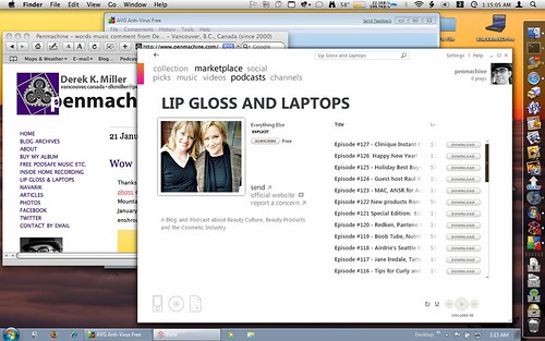
That's the screen of my MacBook, and you can see both native Mac programs (like Safari and the Finder) and native Windows programs (the Zune application and AVG anti-virus) running at the same time. I'm using Parallels Desktop to run both Mac OS X Leopard and the new beta version Windows 7 simultaneously. I can also reboot the MacBook into full native Windows 7 for extra speed and some additional interface eye candy.
Why did I do such a thing, and why install Windows on my Mac on January 22, the 25th anniversary of that famous Mac "1984" ad? Well, mostly because the Windows 7 beta is free (though if you want to get it, today is supposedly the last day), and it will work until August. I wanted to see how the new version is shaping up.
Because, honestly, I was falling a bit behind. After that magazine job, I worked at a Windows software developer for almost five years using Windows 98 and NT 4, then as a freelance technical writer working with NT 4 and Windows 2000. I only had a Windows laptop briefly when I first started at Navarik in 2003, then went Mac at work again. I never really did much with Windows XP, and I'm not sure I ever used Windows Vista at all myself, though I've seen others use it. As I said, our home was a Mac zone the whole time.
I needn't have worried. Windows 7 is a tweaked, improved, more secure version of Windows with better fit and finish, but it's still Windows. The Taskbar and Start menu and Windows Explorer are still there. So is the dreaded Registry Editor. As a listener to the Windows Weekly podcast since it began in 2006 (hey, I should listen, since I wrote the theme music—on a Mac), I knew how to get the beta version working best for me, and what to install for best results (Windows Live Essentials and Live Mesh, for instance).
In this new Internet age, with Macs more popular then ever, I have less reason than I did in 1995 to run Windows. But I like to keep current, and it's a bit of a thrill to see my MacBook boot up Windows like a real PC. Ahem.
Labels: apple, geekery, macosx, memories, software, windows, windows7
20 May 2008
Wheels within wheels
I used to teach courses about Microsoft Word. Stuff like this (via John Gruber) is what made me stop.
Labels: apple, macosx, microsoft, publicspeaking, software
30 January 2008
Links of interest (2008-01-30):
A bunch of stuff I've been accumulating over the past few months:
- Types of coffee beverages
- U.S. regional pizza styles
- Build your own Apple Store
- Google Maps mashup of how Greater Vancouver would be flooded by a 4-metre sea level rise (move around to check out your own area nearly anywhere in the world)
- J Allard's thoughts on the first year of the Zune
- Very useful Cascading Style Sheets (CSS) reference for web developers
- How well does restoring from Apple's new Time Machine backup work?
- Intro to Fully Flared features slo-mo skateboarding, explosions
- When you post to your blog, where does the information go?
- Tips to give presentations more like Steve Jobs
- What other sites are on your shared web server?
- How Microsoft would reveal it hasn't done its homework in school (see?)
- New Apple instructional videos
- Long Radiohead video that features all the songs on In Rainbows
Labels: apple, backup, band, blog, environment, extremesports, food, google, linksofinterest, macosx, microsoft, music, publicspeaking, web
09 January 2008
NetNewsWire is now free
I've used NetNewsWire as my RSS reader on the Mac for years. It's the best program of its kind, in my opinion. And now it no longer costs money. I sat for lunch with developer Brent Simmons and his wife Sheila a few years ago, and he is not only a smart programmer, but a nice guy.
If you read a lot of websites and blogs and would like to get the latest without constantly hopping from site to site, RSS is the way to go, and NetNewsWire is the way to get it if you have a Mac. Go download it.
Labels: geekery, macosx, rss, software, web
22 November 2007
The sad family of iPod Touch fonts
Apple's iPhone and iPod Touch ship with a rather limited range of web fonts, and as John Gruber wrote back in the summer:
It's a shame this wonderful display is being held back by such a poor selection of installed fonts.
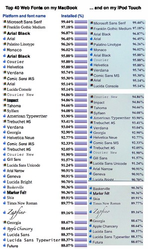
I wanted to see what this meant in real-world usage, so I hopped over to Code Style's Top 40 Fonts list of most popular available type options on the Web, updated by surveys earlier this month. Here was the result when I compared the font list displayed on my MacBook (left) to the same list on the iPhone (right)—click for a full-size PNG-format version:
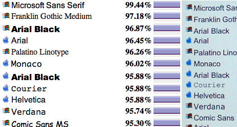
Notice how few fonts actually display as themselves. Of the top ten, only three (Arial, Helvetica, and Verdana) show up correctly. Courier is actually the flimsier Courier New, and everything else defaults to one variant or other of the built-in Helvetica or Arial sans-serif typefaces. Here's a close-up:
Further down the list, some of the choices (Marker Felt, Zapfino) are just bizarre to include, while others (Gill Sans, Futura, the Lucida family, my old fave Palatino) are sadly absent. I'm happy to see Georgia in there, and equally pleased that Comic Sans isn't.
Text looks great on the high-density iPod screen—it's a pity there aren't more interesting fonts to try on it. On the plus side, it's quite possible that Apple or others might be able to install some better ones through future firmware updates or software installations.
Here's hoping.
Labels: font, gadgets, geekery, iphone, ipod, macosx, typography
20 November 2007
iPod Touch: my first impressions and review
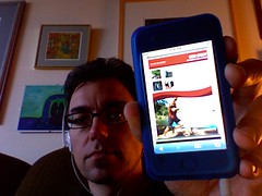 Since I'm on medical leave from work and am sitting at home feeling slightly barfy, I've had a fair bit of time to try out the iPod Touch I received yesterday. My summary: like its sibling the iPhone, it is a fantastic little portable computer. For video, enhanced podcasts with artwork, listening in the car, web browsing, and reading text, it's fabulous. However, as a pure portable music player, I think the other iPods are superior. Here's why.
I miss the click wheel
The iPod Touch and iPhone lack the classic iPod click wheel, or even the round switch arrangement of the iPod Shuffle. The Touch and iPhone screens are big, beautiful, touch-sensitive blank slates—which makes them impossible to use if you can't see them. So when my iPod Touch is in my pocket, I can't skip songs, change the volume, scrub through a podcast, or even pause a track without taking it out to look at it. When I'm on the go, it's therefore slower and more awkward to use than my 5G iPod.
Yes, if you have an iPhone (not yet available in Canada), the headphones include a simple remote to address some of those problems; on the iPod Touch, you need to buy a third-party remote, which I'm seriously considering. Even then, you have only rudimentary, iPod Shuffle–like control over your player.
The click wheel is one of the great genius pieces of design in Apple's iPod lineup, a patented, distinctive component of the iPod's success since 2001. It's brave of the company to ditch it entirely on these new flagship models, in favour of the remarkable new "pinch, tap, and flick" multi-touch interface. But when you're used to the familiar thumb-spinning action of the click wheel, having to hunt for onscreen sliders and scrubbers and virtual buttons is, simply, a chore.
Good for music, great for much else, destined to get better
Don't think that I dislike the iPod Touch. When I use it, it feels like a piece of the future in my hand. I'm hugely looking forward to Apple's promised software development kit (SDK), coming in February, after which programmers everywhere will be able to create all sorts of amazing applications for it, from document readers and word processors to games and screen savers—on top of the already impressive selection of web apps out there. Right now we're limited to the programs Apple ships on it, which are interesting but few.
Because it is a more general-purpose device than other iPods, I find there's more tapping and menu navigating on the Touch, because it does more, but that makes it a little slower to use for most tasks. Some features I've become used to with other iPods, such as using my Belkin audio recorder or setting up the device as a USB flash drive, are unfortunately gone too. Like most iPods, it also feels rather fragile on its own, so I picked up a silicone case and screen protector today from Westworld, seemingly the only retailer in Vancouver with any iPod Touch accessories at all so far.
Compared to the iPhone, it has no camera, speaker/mic, physical volume switch (argh!), headphones with mini-remote, or certain built-in applications (local client email, Google Maps, etc.)—so you have to use them via the Web. The colour scheme is a bit different too. The front bezel is dark, and the back is the usual smudge-o-licious iPod chrome, rather than the flat metal of the iPhone.
It does have a YouTube app and, best of all, Apple's Safari browser. Most websites work perfectly, and the ability to zoom, rotate, and manipulate the display makes everything from using Gmail or WordPress or Blogger to reading blogs and news sites simple and surprisingly pleasant for such a small screen. The onscreen keyboard doesn't beat something real to type on, but particularly in landscape mode it works tolerably with my largish fingers. (Someone who builds an external keyboard for this thing will sell quite a few.)
I think it would make a great e-book reader, but right now there is no easy way I know of to load up text or PDF documents for reading. The Touch can display PDFs and text files from the Web very well (though I wish text files would word-wrap more neatly), but unless you want to set up your own web server (not hard for webby geeks like me) or email yourself a book (feasible but awkward), we'll have to wait for the SDK before that's easy.
Early in the revolution
The multi-touch interface is a revolution, though an early stage one. My fingers are finding themselves a bit confused. I still instinctively try the circular motion of the click wheel when wanting to adjust the volume, pause, or change tracks.
And when I get back to my MacBook laptop, I'm really flummoxed, because there I can scroll with two fingers on the trackpad too. But the scrolling direction is (quite logically, but still contradictorily) completely the opposite of the flicking motion on the Touch. On the MacBook, to scroll a page down I put two fingers on the pad and drag them down; on the Touch, I use one finger on the screen and flick the page up. The transition is like switching between two languages you're fluent in—it takes a bit of time for your brain to make the change.
The cool factor of the iPod Touch is certainly hard to beat. The screen is super-sharp, and photos and video look just great on it. The Touch also works perfectly with my car FM adapter, and in that context it's better than the old iPod because you can see the screen better—but I had to turn the brightness down when I tried it last night, because it was like a searchlight compared to the dashboard instruments!
A device unsure of itself
When the iPhone first came out, many people wanted one without the phone part. The iPod Touch is pretty close, but that also makes it a device that isn't quite sure what it wants to be. Is it a portable computer? A music player? A video device? A web appliance? Well, yes and not quite. Apple positions it and the iPhone as their top-of-the-line models, but if you listen to a lot of audio, or need to record, or like to store data too, think carefully. The massive storage and reliable old click wheel of the iPod Classic or the miniscule convenience of the iPod Nano might work better for you.
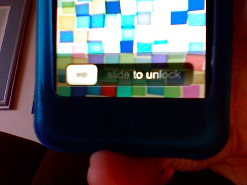
Despite that, I suspect that I'll be carrying and listening to the iPod Touch a lot more than my old 5G iPod. When I wake the screen from sleep and slide the virtual switch to unlock it, or flip the iPod sideways and watch the screen display flip too, or grab a chunk of web page and move my fingers to zoom it, or flick a list of podcasts and observe the carefully-calibrated ballistics of how the list decelerates to a stop, there's something amazing about that experience. It's a new kind of computer in my pocket.
A few niggles here and there don't negate the amazement. And I get the feeling that once it's no longer amazing, that experience will simply be something I expect, and almost everything else will seem old-fashioned.
Labels: apple, design, gadgets, geekery, ipod, macosx, music, video
14 November 2007
The best technical writing on the Web
This week's issue of TidBITS, a free online Mac-focused newsletter published by Adam and Tonya Engst continuously since 1990, exemplifies why I've been a subscriber for so long (I can't even remember when I first signed up). Two articles were particularly impressive: Matt Neuburg's Spotlight Strikes Back and Glenn Fleishman's Google's View of Our Cell Phone Future.
TidBITS regularly takes its coverage of tech topics several steps deeper than most other media, online or offline, even when its articles are short. I don't think you could find a better explanation of the vastly improved Spotlight search feature in Apple's latest "Leopard" operating system release than Matt's. I learned not only what's better about Spotlight in Leopard (nearly everything), but also some of its engineering quirks and powerful search syntax. Much better than anything Apple offers.
Glenn's article about Google's new "Android" mobile phone platform announcement is a masterpiece. He summarizes the international history and technical infrastructure of the entire cellular phone industry; Google's motivations and activities so far—and those of its partners in the consortium—in introducing Android; and how it compares to, and might affect products and strategies from, competitors such as Nokia/Symbian, Microsoft, and Apple. All in fewer than 3000 words. I worked for a wireless telecommunications company several years ago, and I still learned lots of new things.
Yes, I've written for TidBITS in the past, but that just puts me in honoured company. Articles like Matt's and Glenn's are some of the best general-audience technical writing on the Web.
Labels: apple, macosx, telecommunications, tidbits, writing
10 November 2007
Software update hell
Microsoft has been diligent in releasing updates to its Office 2004 suite for Mac, largely to address security vulnerabilities. That's good. But their updater software sucks. Here's why:
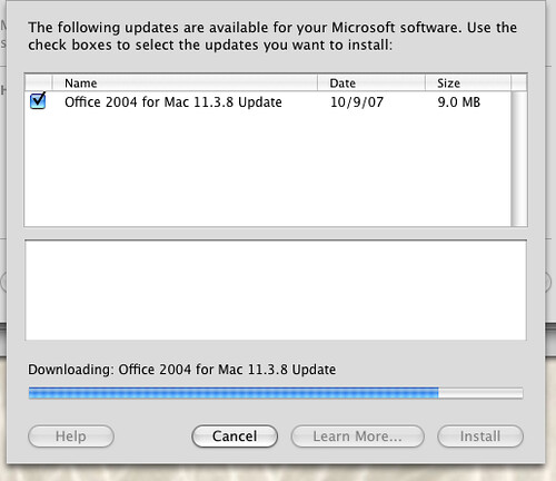
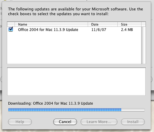
The latest update is version 11.3.9. It turns out that I hadn't updated since 11.3.4 or thereabouts. Now, you'd think that the 11.3.9 update would update any version of Office to the latest version. Nope, here's what I had to install today:
If you look at those screenshots above, you'll notice that only one update appears in Microsoft's AutoUpdate software at a time. That's right, I had to run the updater, apply the version 11.3.5 patch, quit that, run the updater, apply the 11.3.6 patch, quit that... and so on.
I fear to think how long it would take if I had to reinstall from my original-release Office 2004 (11.0.0, I guess) disc. I suppose I should be glad I didn't have to reboot each time!
UPDATE: I forgot to link to my previous rant from last year about the even worse procedure I went through with Adobe Reader.
Labels: design, macosx, microsoft, software
01 November 2007
Mac OS X 10.5 Leopard first impressions
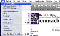 So far I've installed Apple's new operating system on three computers (a MacBook, an iBook, and an iMac), and in each case it's gone quite smoothly. The most awkward part was clearing space on my MacBook and my wife's iBook—we're both prone to stuffing the hard disk almost to the brim.
I followed John Gruber's advice, creating a bootable backup first (something I've always done for previous upgrades), then performing a simple upgrade installation, without my usual overcautious "install and migrate" procedure.
Overall it's an unremarkable transition, and I mean that positively. There are cosmetic changes, some good, some bad, but everything operates pretty much as before. My unexpected favourite new features are Spaces (I never liked virtual desktops before, but Spaces is so seamless it really works for once), Quick Look, and screen sharing (sure to be a godsend for remote tech support with my in-laws). Oh, and Spotlight search actually works now.
Like many others, I dislike the new translucent menu bar, which doesn't mesh with the desktop pictures I prefer. But there's an easy solution: I just edited my desktop picture to have a white strip across the top the same height as the menu bar, and now it's back to readable again.
Labels: apple, geekery, macbook, macosx
29 October 2007
The only Mac OS X Leopard review
If you look at no other material (not even Apple's own web pages) about the latest version of the Macintosh operating system, Mac OS X 10.5 "Leopard," which came out on Friday, then read John Siracusa's 17-page in-depth review. It tells you everything you need to know and more, just like the ones he's written for every previous version of Mac OS X going back seven years.
UPDATE: I should have made it clear beyond my geekery tag that this is a Mac OS review only for a certain type of user, of which I am one. To quote:
While the casual Mac user [i.e. normal people - D.] will gauge Leopard's worth by reading about the marquee features or watching a guided tour movie at Apple's web site, those of us with an unhealthy obsession with operating systems will be trolling through the internals to see what's really changed.
I fully count myself among those with an "unhealthy obsession with operating systems"—people like this guy. Hell, I laughed out loud in public at a joke about font rendering (!) in the command-line Terminal (!!). In the chemotherapy lounge at the B.C. Cancer Agency, even (!!!). If that doesn't seem out of line to you, saddle on up.
Labels: apple, design, geekery, macosx
20 October 2007
Look and feel
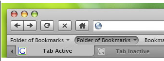
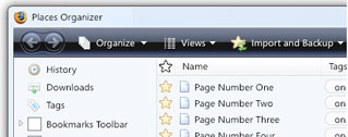
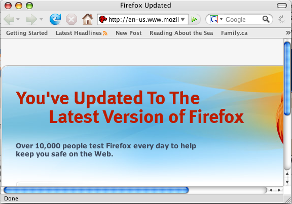
I like what the Mozilla Foundation developers are doing with the user interface for the upcoming Firefox version 3 web browser: matching the interface elements to the operating system:
While Firefox looks good now...
...sharing a general appearance with other applications in Windows or the Mac OS will make it a better experience, and I think it's a good investment of developer time.
Labels: apple, design, firefox, macosx, microsoft, software, web, windows, windowsvista, windowsxp
16 October 2007
Apple taking pre-orders for Oct 26 operating system release
Apple has finally announced a shipping date for its long-awaited Mac OS X 10.5 operating system, codenamed "Leopard." And it's close: only 10 days away, at 6 p.m. on Friday, October 26.
The new OS has a whole bunch of new features, including some whizzy but (in some opinions) questionable new interface changes, but I think the best part is the new Time Machine automatic backup application. It requires a separate hard drive volume of equal or greater size to your main one, but it at last makes simple the process of backing up and restoring files. Finally! (I wrote that Apple should do this a year before the first version of Mac OS X came out, and Windows has had something similar for years, though I know few who use it or know it's there.)
However, if you're running a mission-critical production system, as always, I'd recommend you wait to make sure that all your gear and software is compatible with the new release, make a full backup in case anything goes wrong, maybe test out the update on a non-critical Mac first, and make any updates to your main machine when you have time to spare for troubleshooting. This is Apple's first major OS update in two and a half years, and some major changes have taken place under the hood.
You'll need at least an 867 MHz G4 or better processor (the iMac DV in my kitchen is stuck with 10.4 Tiger), a whole whack of RAM (Apple says 512 MB, but I'd recommend at least 1 GB), and 9 GB or more of free hard drive space to install Leopard. And obviously, the newer, faster, and more tricked-out a Mac you have, the better it will perform. Generally, Apple has kept performance on older Macs pretty good with new OS releases, so I'll be trying it out on my eMac too—on some occasions new OS releases have even been faster than previous ones.
Often the major limiting factor isn't your processor or storage, but how powerful a graphics chip your Mac includes, because a lot of the new features use the graphics GPU for screen eye candy like Cover Flow and other animations.
Prices are much the same as before: about $130 for a single license, $200 for a family five-license pack, and $116 for the education rate (a bit higher than before). The cost is the same in U.S. and Canadian dollars, although even at that it's now cheaper by a few bucks for us Canadians to pick up the American version. I know, we can't shut up about that. If you buy a Mac with 10.4 Tiger on it between October 1 and the end of the year, you can get a cheap upgrade to Leopard for $10.
Labels: apple, geekery, macosx
24 June 2007
Facebook Friends Photos screen saver
 My absorption into the Borg that is Facebook is complete.
This morning, via the Macalope, I found the Facebook Friends screensaver for Mac OS X. You can set it so that it displays random photos, random albums, or (my choice) current profile pictures of all or some of your friends on Facebook, in a groovy Apple-style moving field, where the photos snake back and forth across a minimalist digital landscape with reflections.
Crazy crazy.
Labels: apple, facebook, friends, macosx, screensaver
23 June 2007
Saving Tod Maffin's bacon via cross-country tech support
 Because I'm still recovering from all the radiation and chemotherapy and such, I can't attend the Podcasters Across Borders conference in Kingston, Ontario this weekend.
However, I was able to provide cross-country phone tech support to get Tod Maffin out of a bind when his Mac Finder kept repeatedly crashing right before his 8 p.m. (EDT) presentation. We even delved into some Unix permissions wizardry for good measure.
Good luck Tod!
And yes, I'm feeling better today, so I think it's okay if I gloat a little.
Labels: apple, cancer, chemotherapy, macbook, macosx, pab2007, podcast, radiation, techsupport, todmaffin
11 June 2007
Safari for Windows
While there was neat information about Apple's new Mac OS X 10.5 "Leopard" operating system, coming in October, there wasn't all that much amazing or unexpected during the company's keynote presentation about it today. No new computers or iPods, for instance.
What was unexpected is the new beta of the Safari browser, which is suddenly available not only for the Mac, but also for Windows XP and Vista for the first time.
UPDATE: Macworld discusses some key features of the new browser. The new Find command is awesome—finally I'm no longer hunting for the result in a sea of text. That and the draggable/tear-offable tabs are worth the upgrade in themselves.
Labels: apple, browser, design, macosx, safari, windows, windowsvista, windowsxp
