Penmachine
09 October 2009
Myriad type choices
This week I walked around our neighbourhood a bit and took some photos of signs. I'm not much of a typeface nerd, but I did notice something.
Some years ago, when I designed the first version of penmachine.com, I created the logo header using the font Myriad, which I've liked for a long time:

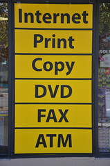
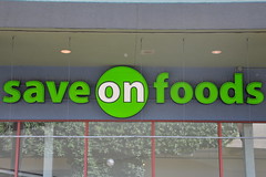
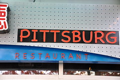
Various weights and styles of Myriad have become my go-to Penmachine fonts, for the cover of my 2005 album, as titles for videos, and so on. When I picked Myriad, I didn't find it too common. But over the past two or three years, it's started showing up more often elsewhere. Here were a couple of examples from my walk:
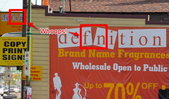
Myriad is versatile and friendly, so I'm not surprised that I'm seeing it more. Of course, there are also lots of... uh... less elegant choices out there:
If you ever wonder what a particular font is, WhatTheFont.com lets you point to or upload a picture and will try to figure it out automatically for you. It doesn't always work, but especially if you have a clean image, it often does a good job.
Labels: font, geekery, vancouver
22 November 2007
The sad family of iPod Touch fonts
Apple's iPhone and iPod Touch ship with a rather limited range of web fonts, and as John Gruber wrote back in the summer:
It's a shame this wonderful display is being held back by such a poor selection of installed fonts.
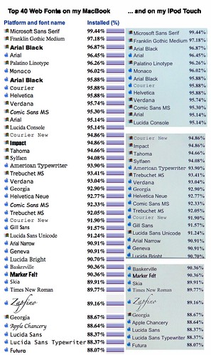
I wanted to see what this meant in real-world usage, so I hopped over to Code Style's Top 40 Fonts list of most popular available type options on the Web, updated by surveys earlier this month. Here was the result when I compared the font list displayed on my MacBook (left) to the same list on the iPhone (right)—click for a full-size PNG-format version:
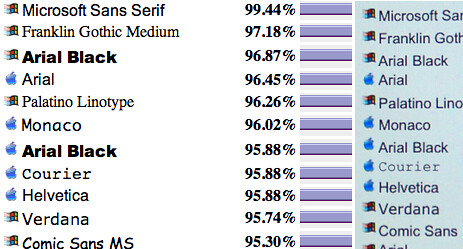
Notice how few fonts actually display as themselves. Of the top ten, only three (Arial, Helvetica, and Verdana) show up correctly. Courier is actually the flimsier Courier New, and everything else defaults to one variant or other of the built-in Helvetica or Arial sans-serif typefaces. Here's a close-up:
Further down the list, some of the choices (Marker Felt, Zapfino) are just bizarre to include, while others (Gill Sans, Futura, the Lucida family, my old fave Palatino) are sadly absent. I'm happy to see Georgia in there, and equally pleased that Comic Sans isn't.
Text looks great on the high-density iPod screen—it's a pity there aren't more interesting fonts to try on it. On the plus side, it's quite possible that Apple or others might be able to install some better ones through future firmware updates or software installations.
Here's hoping.
Labels: font, gadgets, geekery, iphone, ipod, macosx, typography
14 August 2007
Why isn't the Clearview typeface free?
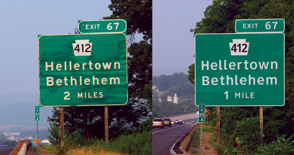 Via John Gruber, here's a neat article about Clearview, a font designed specifically to make highway signage more readable, and now being put to use in many jurisdictions, including here in British Columbia, as old road signs are replaced.
I was a bit surprised to see that if you want to get the font yourself, you need to spend at least $175 USD. If Clearview really is that much more legible and useful than its predecessors such as Highway Gothic, and therefore leads to safer driving, it would seem reasonable for the U.S. federal government or some other agency to pay the designers (who worked on the font for a long time) a decent fee to make it freely licensable to anyone. Then anyone could use it for any kind of signage anywhere, presumably even saving some lives in the process.
Given how many billions of dollars it costs to build roads, the tens (or even hundreds) of thousands of dollars it would take to set up such a free licensing arrangement would seem like money well spent.
Labels: driving, font, johngruber, roads, signs, typography
